It is the easiest way to measure the performance of a classification problem where the output can be of two or more type of classes. A confusion matrix is nothing but a table with two dimensions viz. “Actual” and “Predicted” and furthermore, both the dimensions have “True Positives (TP)”, “True Negatives (TN)”, “False Positives (FP)”, “False Negatives (FN)” as shown below −
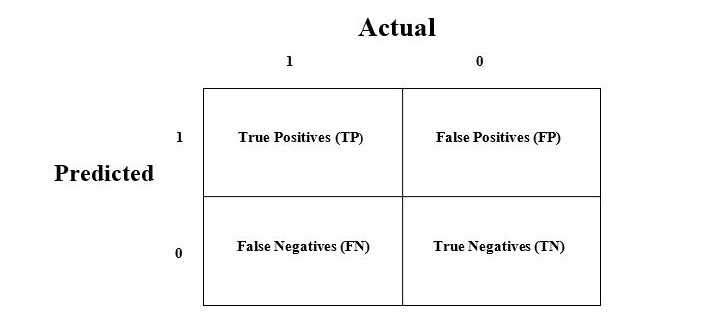
Explanation of the terms associated with confusion matrix are as follows −
- True Positives (TP) − It is the case when both actual class & predicted class of data point is 1.
- True Negatives (TN) − It is the case when both actual class & predicted class of data point is 0.
- False Positives (FP) − It is the case when actual class of data point is 0 & predicted class of data point is 1.
- False Negatives (FN) − It is the case when actual class of data point is 1 & predicted class of data point is 0.
How to Implement Confusion Matrix in Python?
To implement the confusion matrix in Python, we can use the confusion_matrix() function from the sklearn.metrics module of the scikit-learn library. Here is an simple example of how to use the confusion_matrix() function −
from sklearn.metrics import confusion_matrix

# Actual values
y_actual =[0,1,0,1,1,0,0,1,1,1]# Predicted values
y_pred =[0,1,0,1,0,1,0,0,1,1]# Confusion matrix
cm = confusion_matrix(y_actual, y_pred)print(cm)
In this example, we have two arrays: y_actual contains the actual values of the target variable, and y_pred contains the predicted values of the target variable. We then call the confusion_matrix() function, passing in y_actual and y_pred as arguments. The function returns a 2D array that represents the confusion matrix.
The output of the code above will look like this −
[[3 1]
 [2 4]]
We can also visualize the confusion matrix using a heatmap. Below is how we can do that using the heatmap() function from the seaborn library
import seaborn as sns

# Plot confusion matrix as heatmap
sns.heatmap(cm, annot=True, cmap='summer')
This will produce a heatmap that shows the confusion matrix −
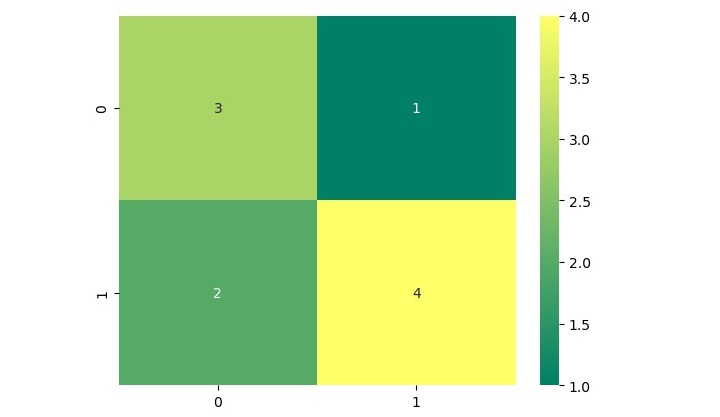
In this heatmap, the x-axis represents the predicted values, and the y-axis represents the actual values. The color of each square in the heatmap indicates the number of samples that fall into each category.
Leave a Reply